Delta
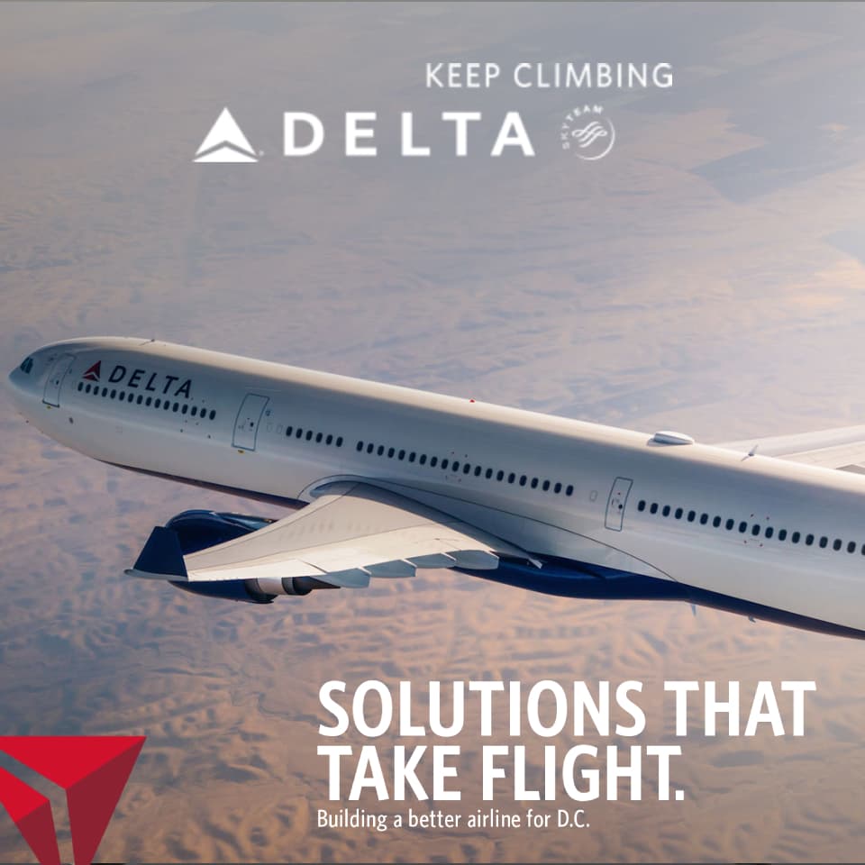
Interactive campaign for Delta Air Lines showcasing cabin classes, route network, and SkyMiles program integration with booking CTAs.
Overview
Interactive showcase for Delta Air Lines. Users explore cabin classes (from Comfort+ to Delta One), browse the route network on an animated map, and connect to the SkyMiles loyalty program. The ad served as a branded mini-site within the publisher page.
Travel-vertical campaigns live on aspiration. The imagery had to make users want to be there.
How It Works
Hero
Page Grabber expands. First destination image fills the viewport. Delta logo and tagline animate in with brand-standard motion.
Destinations
Destination images cross-fade on a timed interval. Each image is paired with a city name, fare hint, and booking CTA.
Explore
Users can pause the auto-cycle and manually browse destinations. Each destination has its own click-through URL to Delta's booking engine.
Book
Route-specific CTAs fire through the ad platform with unique click attribution per destination.
Engineering
Cross-Fade Engine
Stacked full-bleed images with GreenSock opacity transitions. Z-index management ensures smooth layering during the cross-fade without visible flicker.
Route-Specific CTAs
Each destination card carries its own click-through URL and tracking ID, enabling per-route conversion attribution in campaign analytics.
Auto-Cycle Timer
setInterval-driven image rotation with GreenSock transitions. User interaction pauses the timer, manual navigation resets it.
Brand Compliance
Delta's exact blue palette, typeface, and logo clear-space rules enforced. All imagery was agency-approved and pre-compressed to hit viewability load targets.
Engineering Decisions
These destinations are aspirational alternatives, not a sequence. Cross-fading suggests "dream about this one... or this one" rather than a linear catalog browse.
A link to delta.com loses the intent. Deep linking to the fare page for the specific destination shown in the ad preserves the aspiration-to-booking funnel.
Travel ads need to showcase multiple destinations. Auto-cycling ensures users see at least 3 options even if they don't interact, while manual override respects engaged users.
Travel sells on feeling, not information. A full-viewport beach at sunset creates desire. A thumbnail grid creates decision fatigue.
Project stack

HTML5
Markup

CSS3
Styling

JavaScript
Language of the web
GSAP
Animation
More projects

Emirates
Luxury airline showcase with first-class cabin reveals, cinematic pacing, and brand-compliant gold palette
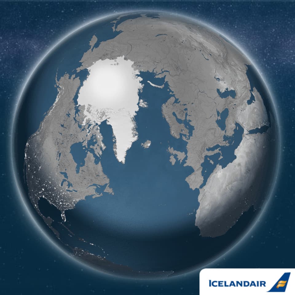
Icelandair
Nordic airline campaign with aurora borealis CSS effects, destination storytelling, and Stopover program promotion
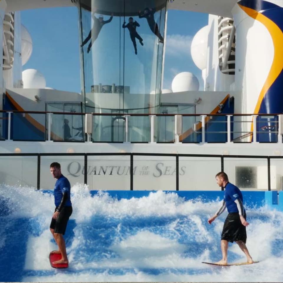
Royal Caribbean
Cruise campaign with ship tour visualization, destination galleries, and stateroom category comparison