Grey Goose
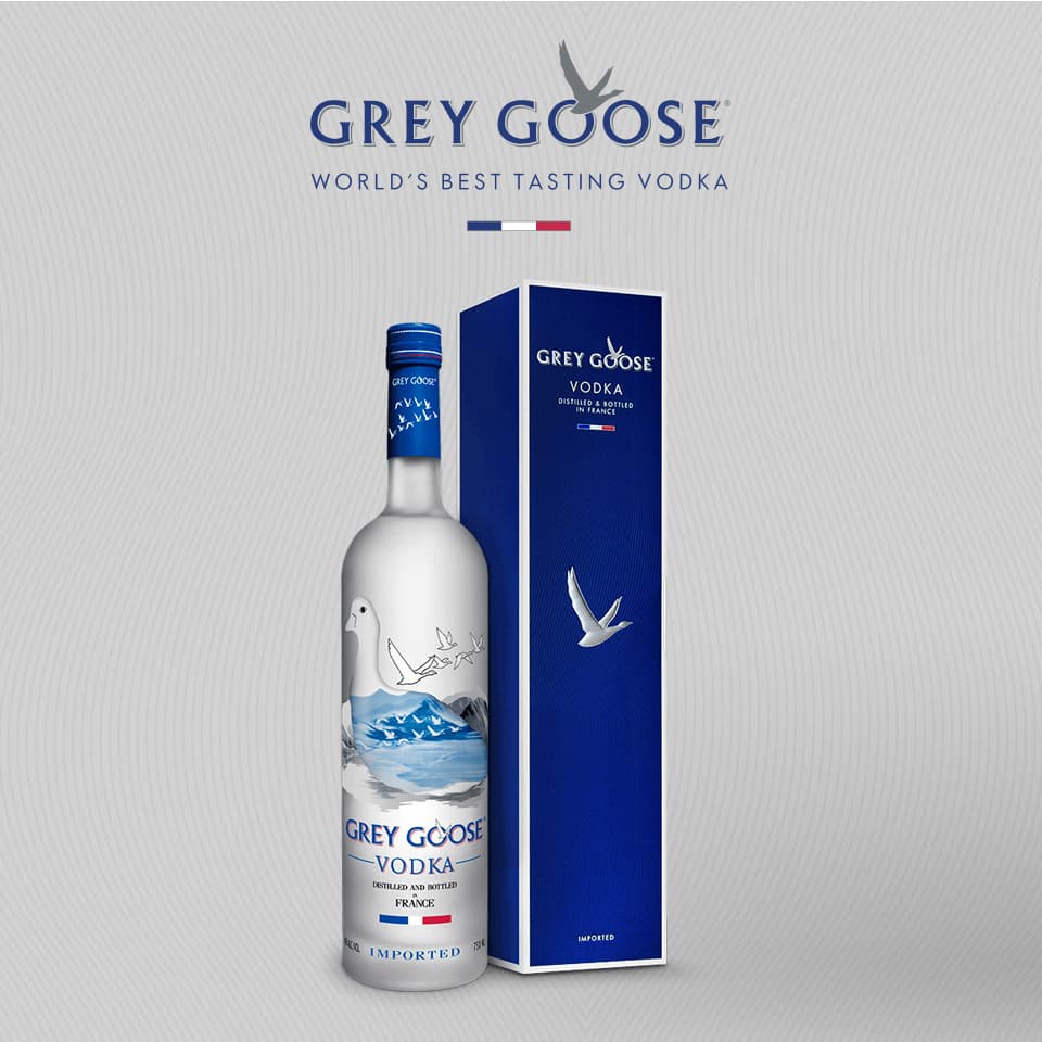
Split-panel interactive ad for Grey Goose vodka. Brand messaging and hero bottle on the left, a 4-tab cocktail menu on the right with recipe cards, ingredient imagery, and article click-throughs.
Overview
A split-panel Page Grabber for Grey Goose vodka. The layout keeps the brand column (bottle, logo, and "Gift Now" CTA) persistent on the left, while a 4-tab interactive menu on the right lets users browse cocktail recipes and article content. The intro animation is a cinematic Greensock reveal.
Context
The intro is a cinematic Greensock sequence: background fade, bottle slide to 90% right while the logo wipes in via animated clip:rect, then everything settles into the split-panel layout. The creative auto-detects the browser and loads Zepto or jQuery accordingly via a proto-sniff check ('__proto__' in {}). The tab system uses instant opacity swaps rather than animated transitions. With 4 content-heavy tabs, transition animations created jank on mobile. Each tab is a static composition: recipe card imagery with a "View Full Article" click-through, all with separate desktop and mobile image assets to preserve the brand's specific crop and composition requirements per screen size.
How It Works
Reveal
Reveal expands. Background fades in, Grey Goose bottle animates into position on the left. Logo wipes in via animated clip:rect.
Menu
4-tab menu on the right panel. Each tab swaps in a different cocktail recipe card with ingredient imagery and article content.
Engage
Users browse recipe cards and click "View Full Article" buttons to navigate to full cocktail content on the Grey Goose site.
Convert
"Gift Now" CTA and logo click-through are always visible on the left panel regardless of which tab is active on the right.
Engineering
Split-Panel Architecture
Left column (left_content) is fixed brand messaging: logo, headline, bottle, CTA, terms. Right column (right_content) is a tabbed container with 4 swappable content areas controlled via opacity toggles.
Cinematic Intro
A Greensock sequence choreographs the reveal: background fade, bottle opacity + slide to 90% right, logo wipe via animated clip:rect, then bottle repositions left as the menu appears. Hardware-accelerated CSS clips keep it smooth.
Library Auto-Detection
A proto-sniff check ('__proto__' in {}) determines browser capability and loads Zepto (lightweight) or jQuery (full) accordingly. This pattern shipped across all campaigns using the shared module library.
Device-Aware Imagery
Every tab panel renders separate desktop and mobile image assets via CSS class toggles. Brand-critical compositions get purpose-rendered crops per screen size rather than responsive scaling.
Engineering Decisions
Premium spirits brands want the bottle visible at all times: it's the hero product. A split panel keeps the brand column persistent while the right side handles interactivity.
Each recipe tab is a pre-rendered image composition with brand-approved typography, layout, and ingredient photography. Static assets guaranteed pixel-perfect brand consistency across every publisher and device.
With 4 content-heavy tabs, animated transitions created jank on mobile devices. Instant opacity swaps are instantaneous and eliminate the risk of mid-transition rendering artifacts.
Grey Goose brand assets have specific crop and composition requirements per screen size. A scaled-down desktop bottle doesn't have the same visual impact as a purpose-rendered mobile crop.
Project stack

HTML5
Markup

CSS3
Styling

JavaScript
Language of the web
GSAP
Animation
More projects
Clinique
Beauty brand product explorer with shade-matching tool, before/after comparison, and ingredient deep-dive
L'Oréal
Dual-format beauty campaign with leave-behind teaser, Swiper color picker, and embedded video player
Saks Fifth Avenue
Luxury retail lookbook with editorial fashion photography, shop-the-look CTAs, and seasonal reskinning