Discover
Interactive campaign for Discover Card featuring cashback rewards calculator, card tier comparison, and pre-qualification CTA.
Overview
Interactive campaign for Discover Card. Users calculate cashback rewards on their spending habits, compare card tiers side-by-side, and check pre-qualification without a hard credit pull. Financial services ads have strict compliance requirements that shaped every copy and CTA decision.
How It Works
Card
Discover card animates into frame with GreenSock scale and rotation. Cashback percentage headline fades in alongside.
Benefits
Rotating benefits cards showcase cashback categories: restaurants, gas stations, online shopping. Each category has its own icon, percentage, and terms.
Features
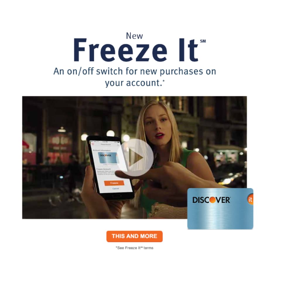
Additional card features (no annual fee, free FICO score, freeze-it capability) animate in as interactive cards that expand on tap.
Apply
Apply Now CTA with pre-qualification language and regulatory disclosure. Click-through tracked via the ad platform.
Engineering
Card Animation
CSS 3D transforms with GreenSock orchestration for card flip, scale, and rotation effects. Perspective set on parent container for realistic depth.
Compliance Layer
Every cashback claim paired with a disclosure element. Disclosure text uses minimum readable font size and always visible within the same viewport as the claim.
Category Rotation
Auto-rotating cashback categories with GreenSock timeline callbacks. Each category swaps icon, percentage, and terms text simultaneously to prevent mismatched display.
Expandable Cards
Feature cards expand on tap to show details. GreenSock height and opacity transitions with overflow hidden to prevent layout shift during expansion.
Engineering Decisions
Financial services ads are regulated. Every cashback claim needs a disclosure. The design was built around the disclosure requirements, not the other way around.
Cashback categories change quarterly. A rotation lets the ad showcase multiple offers without requiring user interaction: important for mobile where attention spans are short.
Mismatched icon/percentage/terms during a transition looks like a bug. Swapping all three elements at once in a single GreenSock callback prevents any frame where they're inconsistent.
Benefits lists in ads are boring. Expandable cards turn information into interaction. Users reveal details they care about and skip what they don't.
Project stack

HTML5
Markup

CSS3
Styling

JavaScript
Language of the web
GSAP
Animation
More projects

Mastercard
Interactive map experience with 9 stadium hotspots, experience cards, and Priceless Cities booking integration

Microsoft
Enterprise tech campaign with multi-product feature showcase and interactive demo mechanics

Delta
Airline campaign with route map visualization, cabin class showcase, and SkyMiles loyalty integration