NY Lottery
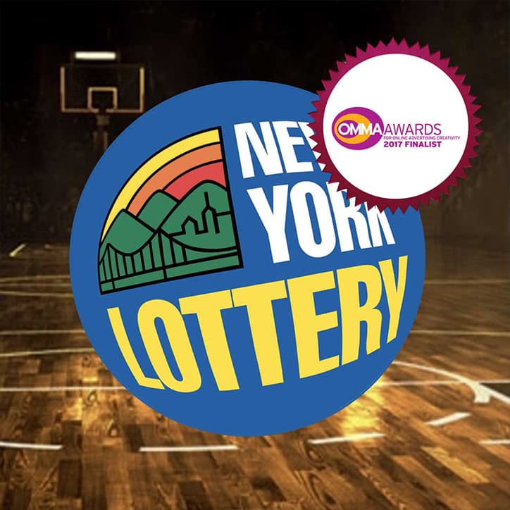
Full-screen PageGrabber X for the New York Lottery's "Champions of Cash" scratch-off game. Split-panel layout with rotating sports venue backgrounds, embedded video ticket preview, and download CTAs for the NY Lottery 3D App on both app stores.
What This Is
A full-page takeover ad for the New York Lottery promoting their "Champions of Cash" $2 scratch-off game. The left side has the headline copy, the right side has a video preview of the actual ticket. Behind both panels, the background rotates between basketball and baseball venues.
The campaign was also pushing the NY Lottery 3D App, so the ad needed to drive two outcomes from one impression: product awareness and app installs.
How It Works
Venue
Full-bleed sports venue loads. Basketball court with gold coin scatter and dramatic court lighting. NY Lottery logo lands in the top-left corner.
Panels
Layout splits. Left: "TAKE YOUR GAME TO A WHOLE NEW DIMENSION" in white bold type. Right: the "Champions of Cash" scratch-off ticket slides in with a play button over it.
Rotate
Background swaps from basketball court to baseball stadium on a timer. The panels stay fixed while the venue behind them changes.
Convert
"LEARN MORE" button with arrow icon. Footer locks in: NY Lottery 3D App badge, App Store button, Google Play button, "Scratch-Off GAMES" label. Responsible gaming text anchored at bottom.
Engineering
Venue Rotation
Background images swap on a timer behind the fixed content panels. Each venue is a full-bleed image that needs to load before it can rotate in, so the first venue stays up while the next one preloads.
Two-Panel Layout
Left panel handles the type and primary CTA. Right panel hosts the ticket with video overlay. On mobile, the panels stack. The tricky part was keeping the ticket preview tappable at every breakpoint without overlapping the compliance text.
Video in Ad
The ticket preview has an inline video player. Tapping the play button starts the video without leaving the ad. This keeps the user inside the unit instead of bouncing to YouTube or a landing page.
Three Exit Paths
"Learn More" goes to the product page. App Store and Google Play go to their respective stores. The video is a fourth engagement point that doesn't exit. Each one gets its own click tracker so the campaign team can see which path converts.
Compliance
Lottery ads need responsible gaming text visible at all times. The disclaimers are pinned to the ad frame so they stay put regardless of which venue is showing or whether the video is playing.
Context
I built this as part of a series of lottery campaigns at Undertone. The coin scatter was where I pushed GreenSock the hardest, staggered position and opacity tweens with custom easing curves to make the coins feel like they had actual weight and bounce instead of just sliding around on a timeline. A lot of trial and error on easing parameters until the motion stopped looking like a PowerPoint and started feeling physical.
State lottery clients also had strict compliance requirements. Every disclaimer position, every interaction had to pass legal review before launch. But honestly, the motion work was the part that pushed me.
Engineering Decisions
The game covers multiple sports. One background picks a winner and ignores the rest. Rotating between basketball and baseball lets the ad speak to fans of both without doubling the media buy.
The headline and the ticket need to be visible at the same time. Centering one above the other pushes the ticket below the fold on shorter viewports. Side-by-side keeps both in view.
Clicking out to YouTube kills the ad impression. The user leaves, watches the video, and never comes back. Keeping the video inside the unit means the download CTAs are still right there when the video ends.
A dismissible disclaimer lets users close it and interact without the responsible gaming message visible. State lottery legal won't approve that. Pinning it means it's always there, no user action can hide it.
A "Download the app" button that detects OS and redirects is cleaner, but lottery campaigns run on desktop too. Showing both buttons lets desktop users text themselves the link or bookmark the store page for later. It also makes the 3D app feel real and available, not hypothetical.
Project stack

HTML5
Markup

CSS3
Styling

JavaScript
Language of the web
GSAP
Animation
More projects

Mastercard
Interactive map experience with 9 stadium hotspots, experience cards, and Priceless Cities booking integration
Discover
Financial services campaign with cashback calculator, card comparison tool, and secure application CTA
Target
Mass retail campaign with multi-category carousel, seasonal reskinning, and per-category CTA tracking